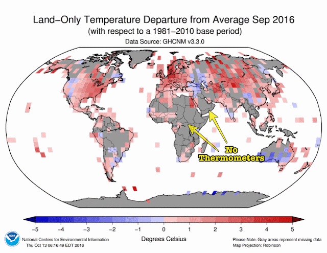
The chart above looks only at land areas including major islands.
Oceans are excluded (white).
The chart was intended to show warming (red) and cooling (blue) but the gray areas are more important
The gray areas have no temperature measurements at all.
So experts make up the numbers out of thin air -- they call it "infilling".
I call it a glorious opportunity to cook the books.
Some people call this science.
But I don't.