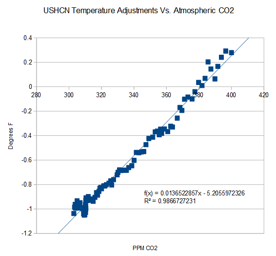
The chart above shows +0.5 degrees F. warming, mainly between 1960 and 2000, just from the "adjustments" to the raw data for the average US temperature!
Some people call this "science".
But I don't.

The chart above shows the US average temperature "adjustments" just happen to match the slope of the CO2 level in the air = someone is cooking the books!
Some people call this "science".
But I don't.